
Some really cool packaging for this ordinary (not anymore) product.
I'm commenting some pictures I've collected from nice packaging sites (listed below) just to have a panoramic view of the trends on packaging for this sweet category.
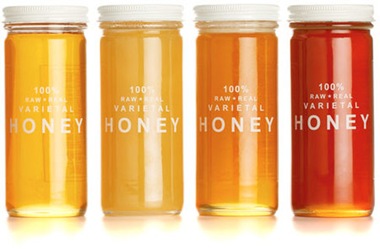
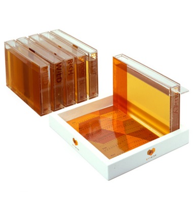
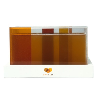
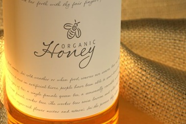
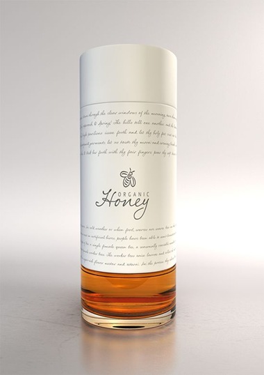
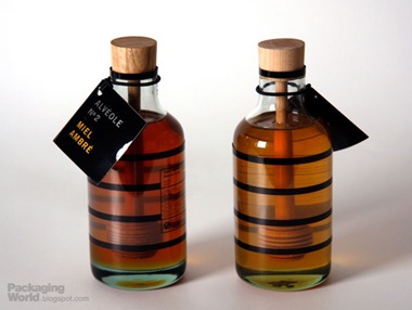
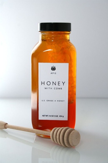
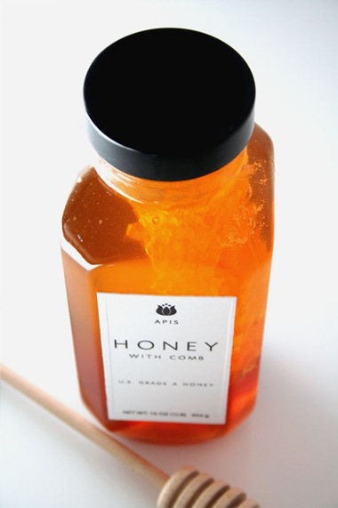
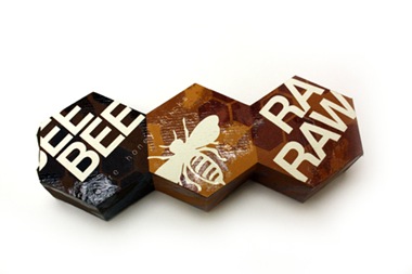
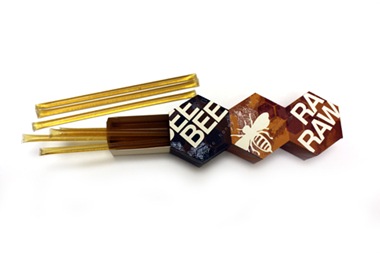
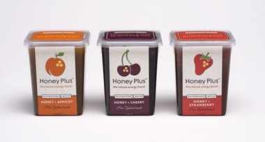
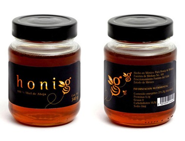
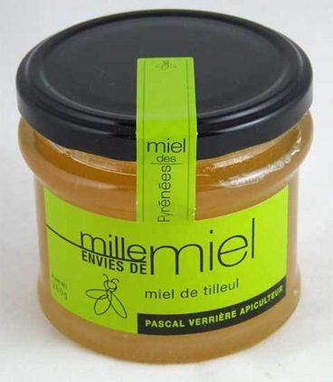
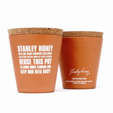
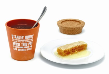
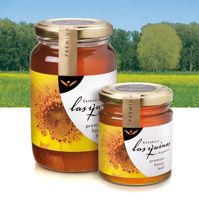
Using Beehive forms and colors - Bees, black & yellow, flowers and hexagons. These elements are the most common to represent the product. Almost all of the packaging pictures we've got here has at least one of these. On the other hand, some very clean projects show much of the product itself inside, what makes it clear for a client that doesn't see any flower, bees or hexagons, what he is about to buy (so very important).
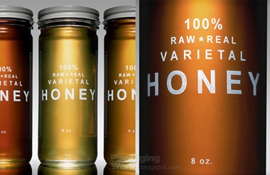
Treated as wine - Honey different flavors depend on the flowers next to the beehives, they can be sweeter, bitter, healthier (depending on the minerals on it), as we see, this 'flavors' are treated in packaging just like a special wine grape variety. That adds a lot of added value on a product that used to be 'just honey'.
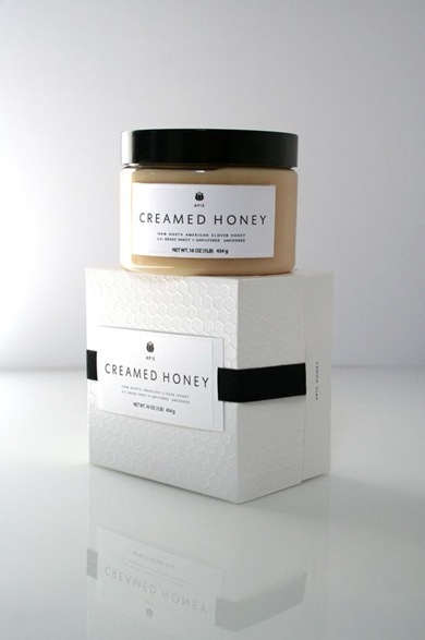
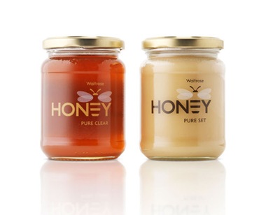
Clean labels - Some very clean labels also call attention. Based on esthetics from other categories, like perfumes for example, these packaging give honey a new status. As I said, honey itself is a very good looking product, its variety composed calls attention on an interesting yellow color scheme.












http://dzinebites.blogspot.com/
http://www.packagingoftheworld.com/
http://packagingworld.blogspot.com/
http://popsop.com/
http://www.thedieline.com/blog/



No comments:
Post a Comment